As every designer knows, a picture can paint a thousand words and the quality of an image is always as important as the content that accompanies it. 2019 has seen a few different design trends, many of which look set to continue well into the next decade. Here’s Probella’s list of the most popular trends in digital marketing for 2019.
1. Isometric Design
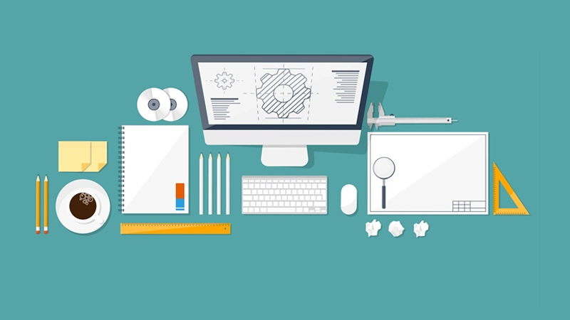
This style of design essentially relates to the practice of creating a three-dimensional object in a two-dimensional space. Or in simple terms, creating a sense of depth and perspective on a flat surface such as a screen or piece of paper. Many app developers have adopted the isometric approach for their on-screen icons to make them more appealing to users. As smart phone and tablet technology continues to improve, customers expect higher standards of aesthetics and the isometric approach looks both professional and futuristic. From designer and developer’s perspective, this technique is particularly helpful when it comes to minimising file sizes, a distinct advantage if you only have limited space to play with. Fewer kilobytes means quicker loading times, too.
2. The Return of Art Deco Style
It may be something of a cliché in certain circles, but the resurgence of the complex, patterned motifs and bold, clean lines of the art deco period can’t be ignored in 2019. From company logos to lettering styles, this ornamental and intricate style is particularly popular with businesses who want to appeal to the young professional market. Whether it’s simply a case of history repeating or a direct reaction to the younger generation’s appreciation for all things esoteric, many design companies are embracing the more ornate, patterned styles over the minimal, angular compositions that defined the earlier part of the decade so strongly.
3. Filtered Photos and After Effects
High definition photography is no longer something that is only available to professionals with expensive equipment. Most standard smartphones can now produce exceptional image quality and with the right filters and aftereffects, even a single person start up can create something of high standard. Filtering photographs so they appear “warmer” is commonplace now, especially in fashion, food and travel marketing. These effects can be achieved at the touch of the button, often using software that’s free to use or very cheap to buy. As a result of this developing technology, the trend for heavily filtered, digitally manipulated images in marketing looks set to continue well into the next decade.
4. Flat Design Mixed with Real Life Objects
This combination creates a striking, three-dimensional effect that can draw the eye to an object as soon as it passes over the page. Things like sneakers, full length garments and headgear are often presented against a flat, neutrally coloured background to help them to stand out. The technique is now so commonplace, you have probably already purchased items that have been presented in this way without even realising. The idea of combining realism with simple, single coloured backgrounds isn’t especially new, but 2019 was the year that saw the vast majority of fashion outlets and clothing retailers adopt this approach as their go to presentation technique.
5. Frameless Photographs and Images
Also known as “open compositions” in the design world, this essentially means that any image or motif is displayed without a frame or border. This creates a fluid, open effect that can be extremely effective, especially on websites with single colour backgrounds or physical media such as flyers and posters. The additional space allows the creative more room to express themselves and the lack of a solid line means there’s scope to blend images seamlessly in to colour gradients or fades. The effect this creates is a sense of freedom and ongoing activity. The viewer is likely to look around the edge of any piece that uses technique, rather than simply focusing on a deliberately framed middle section.
6. 3D Designs
Now that 3D printers are no longer an unaffordable luxury, many businesses are producing physical advertising materials in three dimensions. From abstract, modern art style objects to logo shaped novelty items like keyrings and coasters, there’s been a definite increase the number of businesses using this relatively new technology to present their message to the public. Similarly, photographs and digital renderings that appear to be 3 dimensions are now becoming more common as editing and digital retouching software becomes more advanced. Generally, this is a very effective approach as it forces the 3D item to the front of the image in way that makes it impossible to ignore. A great technique for those selling physical products.
7. Floating Objects
Sometimes referred to as the “anti-gravity” effect, this trend is everywhere in 2019. By juxtaposing images with a solid colour background, designers can create the impression that an object is floating in space. Very popular amongst technology companies and any business that’s wants to present a futuristic image, this technique involves removing shadows and outlines to make the object in question seem to literally jump off the page. From makeup to MacBook’s, this is an approach that advertisers have used extensively this year and the trend looks set to continue for a while yet.
8. Metallic Effects
All that glitters is not gold and this year has seen a huge increase in the number of campaigns using shiny, metallic style logos and imagery to market their products. Iridescent colour schemes are also extremely popular this year as the sci-fi aesthetics of the 1970s and 80s get a much-needed reboot. The reason this technique is so effective is a combination of the novelty, eye catching effect and the suggestion of luxury. Anything in a gold or silver colouring is often viewed as being expensive or desirable. It may sound simple, but principals like this are embedded deep into the collective consciousness of the general public and they’re unlikely to fade out any time soon.

